
Conversion Rate Optimization (CRO) is all about refining your website to increase the percentage of visitors who complete a desired action, like signing up, making a purchase, or downloading a resource.
For most sites, average conversion rates hover around just 2.35%, but those in the top 10% see rates as high as 11.45% or more.
Are your conversion rates looking a little too low? We’ve put together 30 easy-to-use CRO tips and tricks that will put you on the right path to be a part of that top 10%.
We’ll cover a variety of tips, provide resources and videos, metrics to track, and few tools you can use for better optimization.
30 conversion rate optimization tips
We’ve broken these tips into subsections for easier navigation:
- Design and UX
- Copywriting and messaging
- Forms and data collection
- A/B testing and experimentation
- Engagement and retargeting
- Social proof and trust signals
- Tracking and measuring success
- Key metrics to monitor
- Tools for continuous improvement
Ready to learn how to increase your conversion rates?
Design and user experience
With 94% of visitors’ first impressions being made based on your website’s design, having an easy-to-read, well-designed website is key.
- Use a clean and aesthetically pleasing layout
Clutter-free, well-made layouts focus user attention on the essential parts of your page, reinforce your branding, and impress visitors.
Start by removing any unnecessary elements and use visual hierarchy (larger fonts, bold colors) to make key elements stand out.
Then, have a consistent color scheme and layout design between pages. This process will look different for everyone, and if you’re not sure where to start, there are plenty of website design guides and videos online.
Alternatively, you can use these easy-to-use website builders:
- Squarespace.com
- Wix.com
- WordPress.com
Check out these examples to get inspired!
- Optimize for mobile users
With Over 60% of web traffic coming from mobile devices and 85% of people surveyed thinking a business’s mobile website should be as good as or better than the desktop version, making a mobile-responsive design absolutely critical.
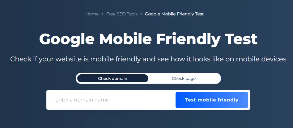
Make sure images and buttons scale properly, text remains readable, and loading times stay fast on smaller screens. Tools like SiteChecker’s Google Mobile-Friendly Test can quickly identify problem areas.
- Improve site speed
53% of mobile visitors will leave a page that takes longer than three seconds to load.
To improve your site speed, compress images, reduce redirects, and use caching. PageSpeed Insights and other similar services are great for identifying slow areas and can give actionable recommendations to reduce load times.
- Utilize white space
White space (or negative space) improves readability and visual appeal by giving content room to breathe.
Avoid crowding elements; instead, use white space to direct attention to the most important elements like CTAs, making the user experience feel more open and organized.
- Make navigation intuitive
Streamlined navigation helps users quickly find what they’re looking for, reducing frustration and encouraging conversions.
Label menu items clearly and place essential links (like “Contact” and “Shop”) where they’re easy to access. Including a search bar for larger sites also helps guide visitors efficiently.
This simple and clean navigation bar on the top of Mangools’ page both directs the eye and gives you all the information you’re looking for.

Copywriting and messaging
While you don’t need to be a digital Shakespere, the writing on your pages needs to be clear, concise, and appealing to your target audience.
- Write compelling headlines
Strong headlines grab attention immediately. Use powerful, action-oriented language and focus on user benefits.
Address common pain points or goals – for instance, “Save Time with Automated Scheduling” speaks directly to people’s needs.
Neil Patel gives some great tips in his guide to writing webpage headlines – be sure to check it out!
- Use social proof
Using testimonials on your website can increase conversions by up to 34%!
Social proof, like testimonials and reviews, go a long way in reassuring potential customers about your product’s value. Consider placing reviews next to key CTAs or on product pages.
Lacking solid reviews? You can get more feedback by using some of the following tips:
- Ask at the right time: Request feedback right after a positive experience, like a purchase or service completion.
- Encourage reviews on multiple platforms: Ask customers to leave feedback on popular review sites like Google, Trustpilot, or Yelp.
- Offer incentives: Discounts or rewards can motivate customers to leave reviews.
- Simplify the process: Provide direct links and short forms to streamline feedback.
- Follow up with emails: Send friendly reminders to recent customers.
- Feature reviews prominently: Showcasing reviews on your site can encourage more customers to participate.
- Write clear and persuasive CTAs
A compelling call-to-action (CTA) uses action-oriented language that motivates users to act immediately.
Phrases like “Start Your Free Trial” or “Get Instant Access” create a sense of urgency, making the benefit clear. Keep CTAs short, direct, and aligned with the surrounding content.
Placing CTAs in highly visible spots, and using contrasting colors can make them stand out and be more effective in encouraging user engagement.
How to design an effective website call to action
- Personalize your content
Did you know that personalized CTAs can boost conversions by 202%? That’s because personalization helps users feel understood and valued.
Write your content to your users’ preferences, using segmented email lists or personalized landing pages based on visitor demographics.
See HubSpot’s guide for more inspiration on personalization.
- Highlight benefits over features
When describing your product or service, emphasize the advantages it brings users rather than just technical features.
Instead of “Our software includes 256-bit encryption,” say, “Keep your data safe from cyber threats.”
Tip: For more free copywriting and SEO tips and tricks, check out these 18 must-read SEO ebooks.
Forms and data collection
81% of people have abandoned a form after starting to fill it out. Why? Reasons vary – it’s too long, hard to interact with, presents possible security issues, and more.
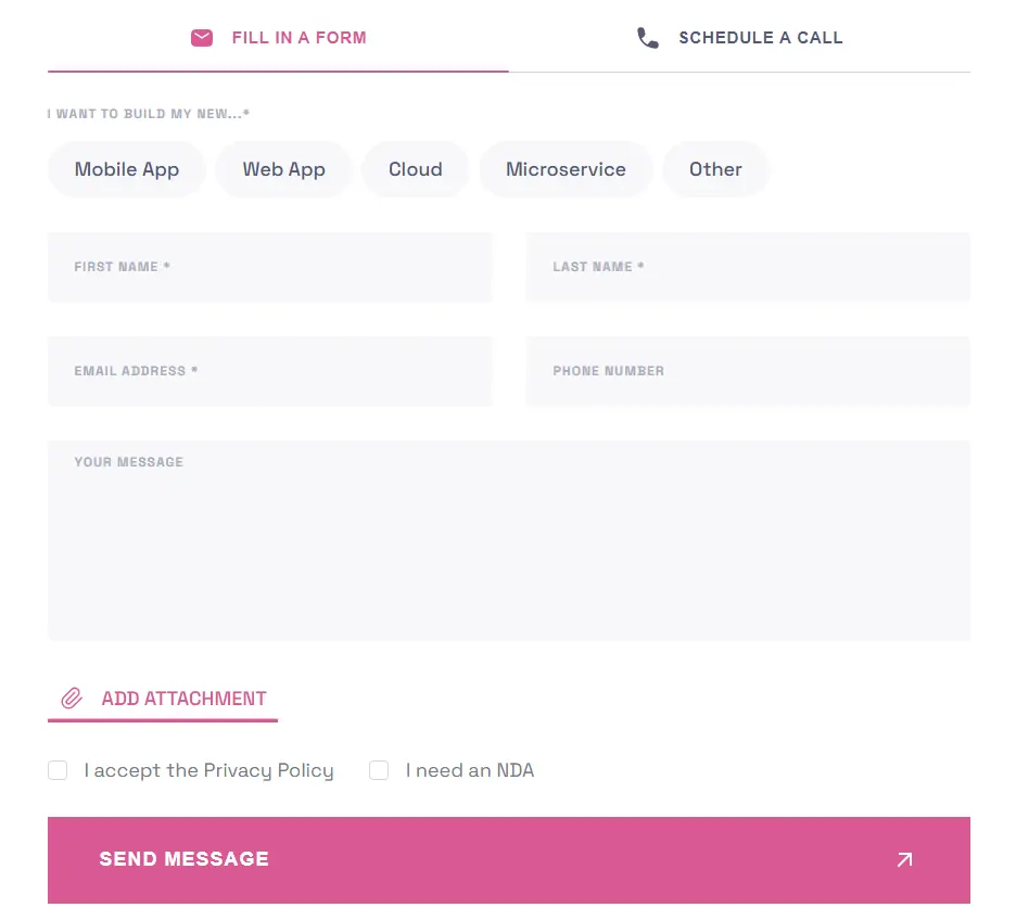
- Minimize form fields
The fewer fields, the better. Long forms can deter users, so include only essential fields. Reducing form fields from 11 to 4 can increase conversions by up to 160%.
For a lead form, stick to basics like name, email, and perhaps a single question related to your goal.
Source: Blocshop.io
- Use inline validation
While online shopping, is there anything more annoying than filling out a form online, hitting submit, and having all the fields go blank because of a missed number or a misspelled email?
Real-time error checking allows users to correct issues on the spot, improving form completion rates. Show errors beside each field, indicating where corrections are needed without a full-page refresh.
- Offer multiple payment options
If you’re running an e-commerce site, providing diverse payment options – PayPal, credit cards, digital wallets, etc. – caters to user preferences, reducing cart abandonment and boosting conversions.
The numbers speak for themselves; being compatible with multiple payment methods increases the likelihood of a purchase by up to 71%.
- Use autofill and dropdowns
Make filling out forms faster with autofill for frequently used details and dropdowns for options like countries. These features reduce typing, especially on mobile devices, and who doesn’t love that?
- Add a progress bar
For multi-step forms, a progress bar helps keep users engaged by showing them how close they are to completion, increasing the likelihood they’ll complete the process. Multi-step forms have been shown to increase lead conversion by a whopping 214%!
For WordPress users, here’s a simple guide:
A/B testing and experimentation
- Test headlines and CTAs
Studies show that A/B testing headlines can improve conversions by up to 30%, so it’s evident that trying out multiple headlines and CTA phrases can reveal what best drives clicks.
For example, try “Sign Up Today” vs. “Start Your Free Trial Now.” Even subtle wording shifts, like using “Today” for immediacy, can make a difference.
If you’re looking to get deep insights, an A/B testing tool might be worth adding to your marketing arsenal.
- Experiment with button colors
Color psychology plays a role in click behavior – test colors to see what works best with your audience.
For instance, red might convey urgency, while blue can imply trust. Start with your brand palette, and run tests to see if users gravitate toward one color over another.
Color Psychology In Web Design
- Try different layouts
Your layout has a direct impact on user flow and comprehension, guiding visitors naturally toward conversion points.
Placing CTAs in prominent spots, like the top of the page or alongside testimonials, helps a lot with visibility. Simplifying the design by testing one-column versus two-column formats can streamline navigation, while visual hierarchy and contrasting colors can make CTAs really pop.
Limiting distractions, adding subtle visual cues (like arrows or images facing CTAs), and repeating anchor CTAs on longer pages keep users focused and encourage action.
- Test various offers
Different promotions appeal to different audiences. For instance, offering “10% off” vs. “Free Shipping on First Order” can have a noticeable impact on conversion rates.
Run tests on limited-time offers versus consistent discounts to identify which approach appeals most to your customers.
Not sure what direction to go? These statistics might give you more insight:
- Customer preferences: While 60% of customers favor discounts, 40% lean towards free shipping, making it valuable to test both options.
- Cart abandonment: Free shipping can reduce cart abandonment rates by up to 44%.
- Purchase urgency: Limited-time promotions boost purchase likelihood by 32% by creating urgency.
- Revenue boost: Consistent discounts can increase revenue by 20%, while time-limited offers may spike short-term sales by up to 35%.
- Monitor and analyze test results
Track A/B test results consistently. It’s absolutely necessary to understand statistical significance – only 1 in 7 A/B tests produce substantial improvements, so set benchmarks and run each test for enough time to gather reliable data.
After identifying the winning versions, make changes incrementally to keep optimizing over time.
Engagement and retargeting
No matter how good your website is, you’ll still need to implement some retargeting tactics to get maximum visibility and engagement.
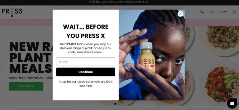
- Use exit-intent popups
Exit-intent popups detect when users are about to leave your site, letting you capture attention with a last-minute offer, such as a discount code or exclusive content.
This can encourage visitors to stay, browse, or even complete a purchase.
Source: WisePops
- Implement retargeting ads
Retargeting keeps your brand top-of-mind by displaying ads to users who’ve visited your site. This strategy, used effectively, can boost conversion rates by re-engaging users and leading them back to complete their original action.
Here are some tools you can use to make these types of ads:
Google Ads remarketing: Google Ads offers retargeting options across websites, YouTube, and Gmail. It’s ideal for reaching a broad audience and customizing ads for different segments.
Facebook retargeting: Facebook’s retargeting through Meta Ads Manager lets you reach users on Facebook, Instagram, and Messenger. With options like dynamic ads, you can target users based on their interactions with your products.
AdRoll: A dedicated retargeting platform, AdRoll integrates with Google, Facebook, and Instagram to provide a cohesive ad experience. It offers dynamic ads, cross-platform retargeting, and detailed analytics.
- Leverage email marketing
Mastering the arts of email marketing helps build lasting connections with your customers, re-engage users who haven’t converted, and drive major revenue from your email list.
Personalized campaigns – like welcome messages, product recommendations, and abandoned cart reminders – have shown to dramatically increase engagement rates.
Key practices such as email warmup and list cleaning help you set up your campaigns for maximum deliverability and success.
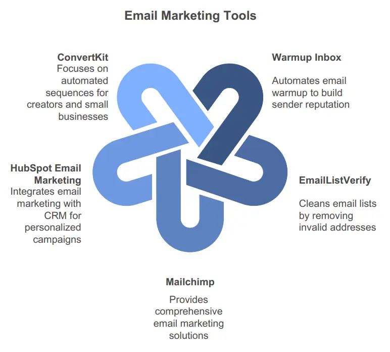
Here’s a list of tools that cover different aspects of the email marketing workflow:
- Warmup Inbox: This tool automates the email warmup process, gradually increasing your sender reputation by simulating real email interactions. It’s ideal for new email domains or accounts that need to build credibility to ensure deliverability in the inbox rather than the spam folder.
- EmailListVerify: A powerful tool for email list cleaning, EmailListVerify identifies and removes invalid, duplicate, and inactive addresses from your list, reducing bounce rates and improving overall deliverability.
- Mailchimp: A popular all-in-one email marketing platform, Mailchimp offers tools for email creation, list segmentation, and campaign automation, perfect for sending personalized newsletters and managing email marketing efforts at scale.
- HubSpot Email Marketing: This tool is great for integrating email marketing with customer relationship management (CRM). HubSpot helps you create personalized, segmented campaigns with built-in analytics to track performance and optimize future campaigns.
- ConvertKit: Especially useful for creators and small businesses, ConvertKit focuses on building relationships with audiences through automated email sequences, segmentation, and personalized messages, making it easy to grow an engaged subscriber base.
- Incorporate live chat
Adding live chat can make a huge difference when it comes to boosting conversions. Having real-time support on your site lets you respond instantly to questions that might hold buyers back.
Try adding live chat to pages where people tend to need that extra bit of info—think product pages, pricing pages, or the checkout. This way, if someone is unsure about a product feature or has a last-minute concern, they can get an answer right then and there.
You can even set up live chat to pop up when visitors show hesitation, giving them a little nudge to keep going.

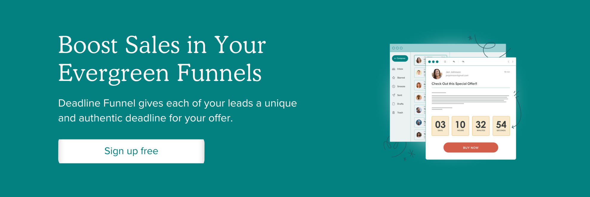
- Create a sense of urgency
Creating a sense of urgency is one of the most effective ways to drive immediate action from your audience. By letting users know they might miss out if they don’t act soon, you create a subtle push that encourages conversions.
Simple tactics like countdown timers on limited-time offers or displaying low-stock indicators on product pages can prompt users to make a decision before it’s too late. These signals keep people engaged and can turn hesitation into a “yes” by underscoring the value of acting now.
For businesses looking to integrate urgency into their email campaigns, Deadline Funnel makes it easy to add customized countdown timers to your emails. With tools like Deadline Funnel, you can create authentic urgency guiding users toward conversion without being pushy.
Plus, it integrates with most major email and website platforms, so you can keep everything streamlined and consistent.
Give Deadline Funnel a try to see how effective urgency can be in boosting your conversions!
[CTA BUTTON]
Social proof and trust signals
Trust makes all the difference. When potential customers see positive reviews, media mentions, or trust badges on your site, they’re more likely to feel secure about buying from you.
Social proof, like testimonials, case studies, and user-generated content, instills confidence, making it easier for people to follow through with a purchase.
Below are some key facts gathered by Datapins that show just how impactful trust signals can be for conversions:
- 72% of shoppers make purchases only after reading positive reviews.
- Displaying reviews or testimonials on your site can boost conversions by 34%.
- 89% of customers are more inclined to choose a business that actively responds to its reviews.
- 57% of consumers prefer services with at least a 4-star average rating.
- 66% of people are more persuaded to buy after watching a video testimonial.
- 50% of consumers feel reassured about trust and security when they see trust badges on a website.
- Websites that display trust badges can experience up to a 48% increase in conversions.
- Add trust badges
Trust badges – such as secure payment symbols, money-back guarantees, or third-party certifications – go a long way in reassuring customers that their information is safe and that they’re dealing with a reputable business.
For e-commerce sites, symbols like SSL certification or “100% satisfaction guaranteed” can make a big difference in reducing checkout hesitation.
Prominently display these badges at checkout, on product pages, and even in your website footer to consistently communicate security and reliability across the user journey.
For brands offering products or services in competitive markets, trust badges can differentiate you from the competition by showcasing your commitment to quality and customer satisfaction.
Check out this guide to trust badges for ecommerce businesses.
- Showcase customer reviews
Customer reviews are powerful trust builders that help potential buyers feel confident in their decision. Displaying authentic feedback from real users can address common hesitations, like concerns about product quality, service reliability, or customer support.
To make the most of reviews, place them strategically on product pages, near calls to action, or even in checkout to give that final nudge.
Highlight a mix of short, impactful quotes and longer, detailed reviews that address different aspects of your product or service.
Additionally, consider using star ratings, verified purchase labels, and customer photos to increase authenticity and create a more compelling experience that encourages new customers to convert.
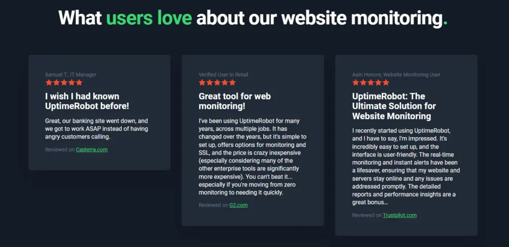
Here’s how UptimeRobot showcases their glowing reviews.
- Use case studies
Case studies go beyond testimonials by offering an in-depth look at how your product or service delivers results.
Reach out to long time clients or those you have a close relationship with and ask if they’d be willing to answer some questions. This level of detail provides prospective customers with relatable success stories that demonstrate your expertise and reliability, while addressing potential objections.
When potential customers see real-world applications of your solution, they’re more likely to trust that you can address their needs, too.
Need some inspiration? Check out our own case studies!
[CTA BUTTON]
- Highlight media mentions and awards
Have you been getting attention from other sites, or have you won any awards? Use them!
Media mentions instantly boost your credibility by showcasing endorsements from well-known publications or industry experts. Featuring logos of reputable outlets that have reviewed or highlighted your product sends a powerful message of trustworthiness and authority.
Placing these recognitions on high-traffic areas like your homepage or “About” page makes them hard to miss, giving new visitors immediate confidence that your brand is well-regarded in the field.
Touch Stay, specialists in digital guidebook creation, have their awards tastefully showcased near the bottom of their homepage.

- Feature user-generated content (UGC)
User-generated content – like photos, videos, and testimonials – brings an authentic touch to your brand that traditional ads often can’t achieve.
People trust content from fellow users, making it a powerful tool for building credibility. Studies show that websites using UGC experience a 28% bump in engagement, as visitors feel a stronger connection to brands endorsed by genuine customer experiences.
Displaying UGC on product pages, social feeds, or review sections not only highlights your happy customers, but also creates a sense of community around your brand, which encourages others to join in.
Tracking and measuring success
After putting all these conversion optimization tips into action, it’s important to know what’s working and what isn’t. Tracking and measuring your results lets you see the impact of your efforts and helps you make data-driven decisions moving forward.
Key metrics to monitor
There are a lot of ways to monitor how you’re doing. These are some of the most helpful metrics to keep an eye on.
- Conversion rate
Conversion rate is the percentage of visitors who complete a desired action, like signing up or purchasing. To improve this rate, analyze where drop-offs happen in the user journey and optimize those areas. - Bounce rate
A high bounce rate (visitors leaving after viewing one page) can signal issues with page relevance, design, or load time. Reducing bounce rate can often lead to better conversions. - Customer Lifetime Value (CLV)
CLV helps you understand the long-term profitability of customers. By optimizing for higher CLV, you can justify investing more in acquisition strategies. - Average session duration
This measures how long visitors spend on your site during a session. A longer session duration generally indicates higher engagement. If visitors are leaving quickly, consider revising your content, layout, or navigation to better capture their attention and guide them through your site. - Pages per session
This metric shows the average number of pages viewed in a single session. A higher number suggests visitors are exploring multiple areas of your site, which is often a positive sign. Low pages per session might indicate a lack of engaging content or poor navigation. - Exit rate
Exit rate identifies the pages where visitors are most likely to leave your site. By identifying pages with high exit rates, you can better understand where users are dropping off and make targeted improvements to retain them. - Cart abandonment rate (for eCommerce)
This metric is critical for eCommerce sites, showing the percentage of users who add items to their cart but leave without purchasing. High cart abandonment could point to checkout friction, unexpected costs, or trust issues. Optimizing these areas can help recover lost sales. - Lead-to-customer conversion rate
For businesses with a lead generation funnel, tracking how many leads convert into paying customers offers insight into the effectiveness of your sales funnel and follow-up process. Improving this rate can significantly boost revenue from existing leads.
Tools for continuous improvement
Optimizing your website is easier (and more effective) with the right tools in hand. Here’s a look at some top tools that can help you experiment, analyze, and refine your digital experiences:
- Optimizely
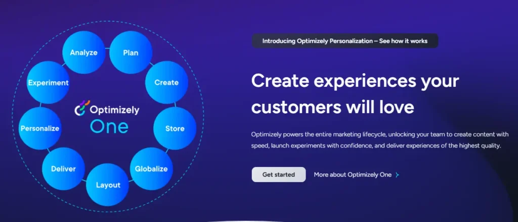
Optimizely is built for businesses focused on refining the customer journey. It lets you test different versions of your site, add personalization, and control feature rollouts, so you’re delivering the best possible experience.
They have many different plan options, and all pricing is available upon request.
Key features:
- A/B testing: Run side-by-side comparisons of different page elements to see what works.
- Multivariate testing: Test combinations of different variables to discover the best setup for your users.
- Personalization: Serve up content tailored to each visitor, based on real-time behavior.
- Feature management: Gradually roll out new features to select groups, keeping control over user experience.
- Visual editor: Adjust elements on your page without touching a single line of code.
- Integrations: Sync with tools like Google Analytics for unified insights and streamlined tracking.
- VWO (Visual Website Optimizer)
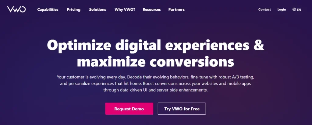
VWO offers services for A/B testing, personalization, and behavioral analysis, making it a strong choice for businesses wanting a deeper understanding of user interactions.
They have a very generous free plan, and paid plans start at $393/month.
Key features:
- A/B testing: Compare different versions of your site to determine the most effective layout and content.
- Heatmaps and session recordings: Dive into how users interact with your site to find areas for improvement.
- Personalization: Segment users and create customized experiences that feel relevant and timely.
- Server-side testing: Test backend changes without affecting the look and feel of your site.
- Mobile app optimization: Extend optimization to mobile, ensuring a seamless experience across devices.
- Data management: Consolidate and manage user data for better targeting and insights.
- Hotjar
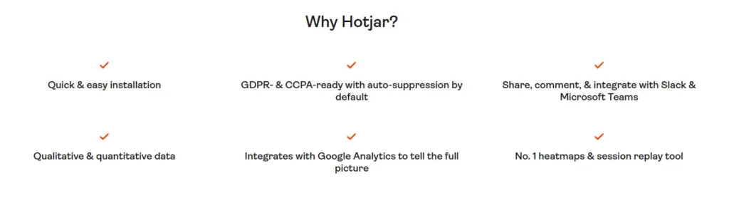
Hotjar is a digital experience insights platform designed to give you a clearer view of how users interact with your website. It integrates seamlessly with other testing tools like Optimizely, Google Analytics, Shopify, and Zapier to better your experimentation process.
Key features:
- Heatmaps: Visual representations showing where users click, move, and scroll on your pages, helping you identify areas that get the most attention or are overlooked.
- Session recordings: Video captures of user interactions on your site, offering insight into how visitors navigate and interact with different page elements.
- Surveys: Customizable surveys to gather direct feedback from users about their experiences and opinions on your A/B tests or website changes.
- Feedback widgets: On-page tools that allow users to leave quick feedback, providing immediate details about user sentiment.
- Dashboard: A comprehensive dashboard that aggregates important user metrics, enabling a clear overview of website performance and user behavior.
Conclusion
Conversion rate optimization can make a profound difference in how well your website meets its goals. When you start using best practices in design, messaging, testing, and user engagement, you’ll be able to create a smoother and more pleasant experience for visitors, and ultimately, improve conversions.
Regularly tracking key metrics and experimenting with changes will help you refine your approach over time.
With consistent optimization and a focus on user experience, you’re not only improving your numbers to shareholders, you’re building a site that appeals to and resonates with visitors, inspires trust, and turns engagement into lasting loyalty.