Email marketing delivers an impressive return on investment (ROI) of up to $42 for every dollar spent. But only if your email can stand out in the inbox and grab the attention of your readers.
Most marketers focus on the email subject line but overlook the importance of the email preheader.
So, what exactly are email preheaders, and how do they affect open rates?
In this guide you can expect to learn why preheaders are the secret sauce to boosting your open rates and getting those sky high ROI’s.
If you’re ready, let’s dive in.
What is an Email Preheader?
An email preheader, sometimes referred to as a preview text or snippet, is a short summary of an email’s content that appears directly after the subject line in an email inbox.

Simply put, an email preheader is the snippet of text that appears right after the subject line in an email preview. This valuable piece of real estate gives recipients a sneak peek into what they can expect when they open your email.
By crafting a compelling preheader, you can not only increase open rates but also improve the overall engagement and results of your email marketing efforts.
What’s the Difference Between Preview Text and the Preheader
Marketers usually use these two terms interchangeably. For the purpose of this guide I’m using the term “email preheader” to describe the text others might call the “preview text”.
And most email software platforms use the term “preheader” or “pre-header” in the admin.
Why and When Should You Use a Preheader in Your Emails?
Preheaders are best used for your marketing emails such as your broadcasts and your email automations.
The email preheader is your opportunity to give a preview, entice your reader, and get your reader to open your email and begin reading.
The Preheader and the Subject Line: Your Email’s Dynamic Duo
By crafting a compelling subject line and preheader combination, you can significantly improve your chances of capturing your audience’s attention and boosting your open rates. Think of the subject line and preheader as a dynamic duo working together to grab your recipient’s attention and entice them to open your email. While the subject line serves as a headline that sparks interest, the preheader offers a brief summary or additional context to further pique the reader’s curiosity.
You want your preheader to work with your subject line like a “one two” punch combination. But avoid repeating the subject line verbatim; instead, use the preheader to complement and enhance the subject line’s message.
How preheaders appear on different devices and email clients
On desktop email clients, preheaders are often displayed to the right of the subject line, while on mobile devices, they typically appear below the subject line.
Desktop Email Preheader Example (Gmail)

Mobile Email Preheader Example (Apple Mail)
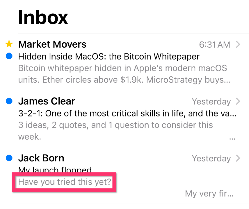
Notice how in these two examples, the mobile email client show more of the email preheader text than desktop device does. The length of the displayed preheader text can range from 35 to 140 characters depending on the device and email client.
How Long Should the Email Preheader Be?
When it comes to preheaders, length matters.
While it’s fine if some of your text in the email preheader gets cut off, you want to make sure you’re delivering the key message of your preheader regardless of where your reader is scanning her inbox.
As a general rule of thumb, aim for a preheader length of 40 to 50 characters to ensure it displays optimally across most devices and email clients.
Keep it concise, yet informative, and focus on providing additional context or teasing the content inside the email.
2 Tips to Make Your Email Preheaders Grab Attention
Here are two tips to spice up your email preheaders and help your emails stand out in your reader’s inbox.
Preheader Tip #1: Personalization
I’m sure you’ve been in a crowded room where all of a sudden you hear your name brought up in conversation. You weren’t even paying attention to the other conversation but instantly your ears perked up when your name was used.
In a similar way you can use personalization in your email preheaders to grab your reader’s attention and boost your open rates. And by addressing them by their first name or referencing their past interactions with your company, you can create a sense of familiarity and relevance. For instance, try using phrases like “Hey [First Name], we’ve got something special for you!” or “[First Name], don’t miss out on these exclusive deals!”
Preheader Idea #2: Using Emojis and Special Characters In Your Preheaders
Emojis and special characters can add a touch of personality and flair to your preheaders, making them stand out in a crowded inbox. However, use them like you’d use seasoning and spices on your food: a little goes a long way. Don’t overdo it.
Not all email clients and devices support emojis, so it’s crucial to ensure that your preheader still makes sense even if the emoji doesn’t display properly. Additionally, be sensitive to your audience and brand voice, and make sure that any emojis or special characters used are appropriate for your target demographic.
5 Ideas for Writing Your Email Preheader
Preheader Idea #1: Curiosity Plus Self Interest
One of the most effective ways to entice recipients to open your emails is by sparking their curiosity. Craft preheaders that tease intriguing content or raise questions that can only be answered by opening the email. For example, you could use phrases like “Discover the secret to doubling your productivity” or “This weight loss hack surprised us…”. By piquing the reader’s curiosity, you’ll increase the likelihood of them opening your email to satisfy their curiosity.
Preheader Idea #2: Pure benefit preheaders
Another angle with your preheaders is to skip the curiosity and hammer the self interest with a direct appeal or promise for your reader. Clearly outline the value they’ll receive by opening the email, whether it’s useful tips, exclusive discounts, or valuable insights. For instance, you could use preheaders like “Unlock your exclusive 20% discount inside” or “5 expert negotiation tips you can use immediately”. By focusing on the benefits, you’ll give your audience a compelling reason to open your email and start reading.
Preheader Idea #3: FOMO-inducing (Fear Of Missing Out) preheaders
Leveraging the power of FOMO can be a highly effective way to drive email opens. When your email is delivering a time sensitive deal (for example when you’re using Deadline Funnel) your preheader can emphasize the urgency and exclusivity. Examples of urgency driven email preheaders include “Only 24 hours left to claim your discount!” or “Seats are filling up fast – don’t miss out!”. By tapping into the psychological triggers of urgency and scarcity, you can boost your open rates and drive recipients to engage with your content. Nothing inspires action as much as a deadline.
Preheader Idea #4: Story Introductions
Our brains are naturally wired to pay attention to stories. And the right story intro hooks our attention until we hear how the story ends (or until we lose interest in the story). You can share a glimpse of an interesting story, personal anecdote, or case study that will resonate with your recipients. For example, try using preheaders like “Passion to profits case study of Jane Smith” or “The unexpected adventure that changed my life forever”.
Another powerful tactic I like to use is to bring readers right into an exciting part of the story or use curiosity about the story to grab attention. Those kind of email preheaders might look like “The day I almost crashed my car…” or “When the car flipped over the rail here’s what happened:”. When you use storytelling intros in your preheader make sure you complete the story so your reader doesn’t feel tricked. I’ll cover this more in the section on mistakes to avoid.
Preheader Idea #5: Surprise
You should use this one sparingly but there’s a lot to be said for “pattern interrupts” where something in your email preheader instantly stands out and grabs your reader’s attention. It could be a statement indicating you’re about to kill a sacred cow such as “Saving money = retire broke”. Or it could be a word image that’s confusing such as “Dog up a tree. True story”. Notice how that last example is an email preheader using surprise, curiosity, and a story introduction.
Common Mistakes to Avoid with Your Email Preheader
Mistake #1: Using Bait and Switch Email Preheaders to Get the Open
No one likes to be fooled. So make sure whatever technique or method you use to grab attention isn’t a trick. If you lead with a story intro, then make sure you tell the story. If you make a direct promise, then you better deliver it in your email.
Successful email marketing isn’t accomplished with gimmicks that fool readers into opening emails that aren’t relevant and interesting. You need to deliver what you promise in the email preheader or you’re just training your audience to ignore your emails or unsubscribe.
Mistake #2: Neglecting mobile optimization
With more than half of all emails being opened on mobile devices, it’s crucial to ensure your preheaders display optimally on smaller screens. Neglecting mobile optimization can lead to truncated or poorly formatted preheaders, which can negatively impact your open rates. Aim for a preheader length of 40 to 50 characters to ensure the best display across most devices and email clients.
Before you send out your emails, make sure you test your preheaders on various devices and email clients to confirm that they appear correctly and are easy to read. And another great idea is to try to structure your email preheader so the most important words come first. For example, “5 expert negotiation tips you can use immediately” is better than “Immediately use these 5 powerful negotiation tips” because the first example will deliver the message even if only the first 5 words are shown.
Mistake #3: Using the default preheader of your email software
Some popular email software uses dreadful default email preheaders if you don’t change your settings or set your preheader manually.

In the screenshot above you see the dreaded “Having trouble reading this email? Click here” email preheader.
Almost any email preheader you write would be better than these default ones.
The Final Word on Email Preheaders
If you want your email marketing to be as successful as it can be you can’t overlook the email preheader. By crafting attention-grabbing, personalized, and engaging preheaders that complement your subject lines, you can significantly increase your open rates and overall campaign performance.
Now that you’re armed with the secrets to creating email preheader perfection, it’s time to put these tips into action. Start by evaluating your current preheaders, then implement the strategies we’ve discussed, such as personalization, urgency, and effective storytelling.
By following these best practices you’ll be well on your way to unlocking the full potential of email preheaders and watching your open rates soar to new heights. So, go ahead – get creative, experiment, and put these email preheaders ideas to use and watch your open rates rise.

