
Creating the perfect landing page is all about making every word, image, and button count—keeping things simple, focused, and irresistible, so visitors are instantly hooked and ready to take action.
From sharp headlines to strategically placed CTAs, every element on your landing page should be designed to keep visitors engaged and moving toward conversion.
Key Takeaways:
- Creating the perfect landing page isn’t about cramming in features but about building a good experience that converts
- Your headline, visuals, and CTA are the MVPs of your page
- A mobile-first approach and fast load times can make or break your landing page
What is a landing page?
If you’ve ever clicked on an ad or email link and ended up on a page asking you to sign up, buy something, or download a free guide, you’ve encountered a landing page. Its one and only job? Convert visitors into leads or customers. Every part of a landing page, from the headline to the CTA button, is designed to move visitors closer to taking action.
Landing pages are effective because they’re focused. Unlike a homepage, which tries to offer information on many aspects of a brand, a landing page keeps the visitor’s attention on a specific offer or goal. And it works: the average conversion rate across industries is 5.86%.
However, with the right design and strategy, you can easily outperform that number. Effective landing pages have been known to reach conversion rates above 10% (and even much higher for certain industries), so every tweak toward optimization counts.
How to create a landing page step-by-step
Creating a landing page that converts isn’t about guessing what works. In fact, you need a plan to make sure yours succeeds.
Here’s a step-by-step breakdown to help you design one that your audience will find irresistible and engaging, guiding them smoothly from curiosity to conversion.
Step 1: Use a builder or go custom?
Do you have time to spare and the skills to design from scratch? If not, a landing page builder is your best friend. Platforms like GetResponse, Wix, and Canva offer easy-to-use, drag-and-drop interfaces and pre-designed templates that can get you started without having to reinvent the wheel.
They might even offer integrations with tools you’re probably already using (like Google Analytics).
On the other hand, if you want something that’s completely unique and you’ve got coding chops, going custom gives you full control. It’ll just take more time.
Here’s a quick breakdown of the pros and cons of each option:
Feature
Using a builder
Going custom
Speed
Fast—get started in minutes with templates
Slower—requires setup and coding
Customization
Limited, but enough for most needs
Unlimited customization options
Cost
Often includes free and low-cost options
Can be costly due to development fees
Design Quality
High-quality templates by professionals
Dependent on designer/developer skill level
Technical Skills Required
None, perfect for beginners
Requires coding knowledge or hiring a developer
Integrations
Built-in integrations (Google Analytics, Deadline Funnel, etc.)
Custom integrations can be added but require setup
Landing page builders are generally ideal for most businesses, especially if you need to launch quickly. Custom-built pages, however, are perfect for brands needing a very unique look and advanced customization.
Step 2: Your headline is your hook
Think of your headline as the first impression that sets the tone. 90% of visitors who read your headline will also read your call-to-action (CTA), so this is where you make them stop scrolling and start reading.

A great headline:
- Speaks directly to a pain point or goal of the visitor
- Is clear and concise
- Promises the value they’ll gain by engaging further
Try a headline like: “Ready to Drive More Sales? Download Our 10-Step Guide.” Specificity and relevance are your friends here—get right to what they’ll gain, and you’ll keep them hooked.
Step 3: Visuals that pull people in
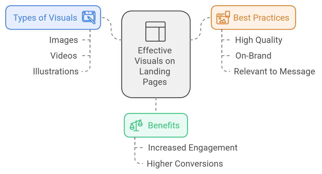
Ever scrolled through a page only to be drawn in by a video or an eye-catching image? That’s because visuals do a lot of the heavy lifting on landing pages. Whether it’s images, videos, or illustrations, make sure they’re crisp, on-brand, and speak directly to what you’re offering.
And here’s a kicker: landing pages with video can boost conversions by 86%. Whether it’s a product demo, a testimonial, or an explainer video, visuals engage visitors who might otherwise just skim.

The visuals on your landing page should be high-quality, on-brand, and support the primary message. No blurry images or random stock photos here—make them count.
Step 4: Nail the copy
The words on your landing page don’t just tell – they sell. Good copy engages with your visitors by addressing their needs and leading them toward a solution (your offer). The AIDA model—Attention, Interest, Desire, Action—can guide you in structuring effective copy.
Examples:
- For lead generation: “Boost your business growth with our FREE eBook—learn the secrets of high-converting marketing.”
- For product promotion: “Transform your workflow with [Product Name] and see results in half the time. Try it free for 30 days!”
- For event sign-ups: “Seats are limited! Secure your spot at [Event Name] for exclusive insights and networking.”
Keep your copy concise and to the point. Focus on benefits, not just features, and speak directly to the visitor’s needs.
Step 5: Call-to-Action (CTA)
Your CTA is where all the effort culminates. It should be clear, action-oriented, and sometimes, urgent. Studies show that personalized CTAs convert 202% better than generic ones. Use direct, friendly language that makes taking action feel easy.
Consider adding a countdown timer to drive urgency. Tools like Deadline Funnel allow you to add dynamic countdowns that create a real sense of FOMO (Fear of Missing Out). These timers are powerful, especially for limited-time offers, and they adjust based on user actions, which means every visitor gets a tailored experience.
Designing for User Experience (UX)
Great UX is the difference between a landing page that feels natural and one that frustrates users. Here’s how to make sure your page provides an optimal experience.
Mobile-first is non-negotiable
With over 60% of web traffic coming from mobile devices, your landing page must look and function flawlessly on a smartphone. This isn’t a nice-to-have anymore—it’s a necessity.
When designing for mobile:
- Use large, tappable buttons for CTAs
- Keep text and images organized for smaller screens
- Make sure forms are easy to fill out without zooming in
Speed matters (a lot)
Page speed is huge—a 1-second delay in page load time can reduce conversions by 7%. No one likes waiting, and your landing page is no exception. Here’s what to keep in mind:
- Compress images to reduce load time
- Use clean, lightweight code that doesn’t slow down the page
- Choose fast, reliable hosting (some builders offer this as part of the package)
Every second counts when it comes to page speed, so optimize early and often.
Keep it clean
The goal of your landing page is to drive action, not overwhelm visitors. A simple, focused design keeps the page visually appealing and makes it easy for visitors to find the CTA.
To achieve this:
- Limit the number of options and distractions.
- Use whitespace to draw attention to important elements.
- Keep text minimal and use bullet points for readability.
Best Practices for Optimizing Landing Pages
Creating a landing page that truly converts goes way beyond great design and clever copy. When you follow best practices and keep an eye on what’s working (and what’s not), you get to fine-tune every detail, driving more engagement and increasing conversions.
A/B testing
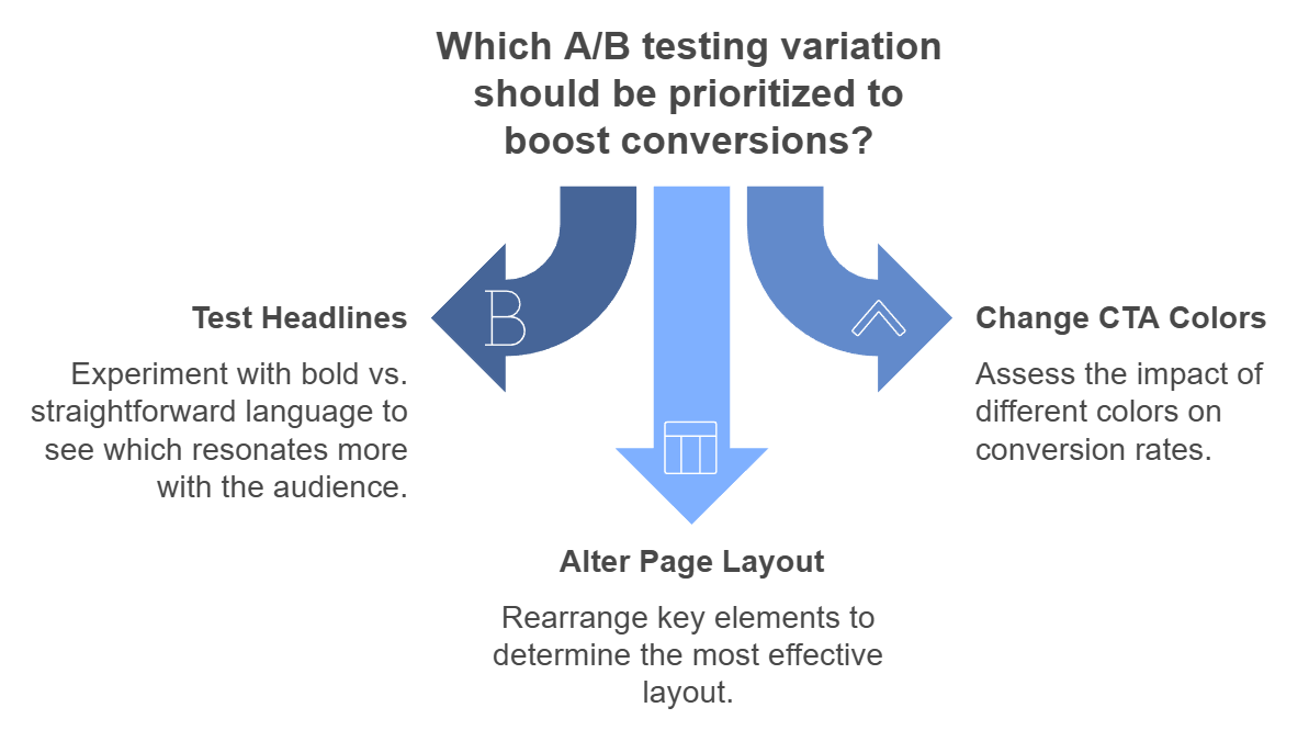
A/B testing lets you experiment with different versions of your page to see what converts best. Companies that embrace A/B testing see an average 49% lift in conversions. Try variations in:
- Headlines: Test bold vs. straightforward language
- CTA Colors: Sometimes, a color change can impact conversion
- Page Layout: Move around key elements to see what performs best
Testing takes the guesswork out of optimization and gives you data-backed insights into what works for your audience.

Social proof sells
Social proof—such as testimonials, reviews, and trust badges—builds instant credibility and assures visitors they’re in good hands. Including testimonials can improve conversions by 34%.
Options for social proof:
- Customer Testimonials: Short quotes from happy customers
- Case Studies: Short stories that highlight real-world results
- Trust Badges: Third-party endorsements or security seals
Measuring Success
A successful landing page is built on constant optimization. Tracking performance over time helps you understand what’s working and what might need improvement, so you can make smart adjustments that improve user experience.
Here’s how to measure its effectiveness.
Key Metrics to Track
- Conversion Rate: The percentage of visitors who take your desired action, like signing up or making a purchase. A high conversion rate is a strong indicator that your landing page is connecting well with its audience.
- Bounce Rate: This shows the percentage of visitors who leave without engaging. A high bounce rate might mean that your messaging isn’t clear or your page doesn’t match visitors’ expectations. Lowering bounce rates often requires refining your copy or layout.
- Average Session Duration: A measure of how long visitors stay on your page. Longer sessions generally mean higher engagement, while short visits might indicate that your content isn’t grabbing attention or that the page needs quicker load times.
- Click-Through Rate (CTR): Particularly useful for landing pages that lead to a secondary conversion (like a sign-up leading to a purchase), the CTR measures how effectively you’re engaging visitors to take the next step. Higher CTRs often mean a compelling CTA and relevant content.
- Form Completion Rate: If your page includes a form, this metric shows how many visitors start and finish it. Low completion rates may mean the form is too long or complicated. Streamlining your form can often lead to more successful completions.
- Page Load Time: Speed matters. A slow-loading page can frustrate users and drive them away. Keep your load times quick with optimized images, streamlined code, and reliable hosting.
Tracking these metrics regularly gives you valuable insights into visitor behavior and helps you make data-driven adjustments that maximize your landing page’s impact.
Tools for analytics
The right tools give you a window into your visitors’ behavior, helping you see what’s working and where you can improve.

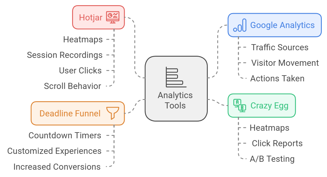
- Google Analytics: Essential for tracking where your traffic is coming from, how visitors move through your page, and which actions they take. It’s a great way to get a high-level view of your page’s performance.
- Hotjar: Offers heatmaps and session recordings, letting you see exactly where users click, scroll, and spend the most time. It’s invaluable for spotting areas that get attention—or places where visitors might be dropping off.
- Crazy Egg: Similar to Hotjar, Crazy Egg provides heatmaps and click reports, along with A/B testing tools so you can try out different versions of your page to find the most effective layout and design.
- Deadline Funnel: Creates time-sensitive offers that add urgency to your page, helping to increase conversions. Dynamic countdown timers and customized user experiences give visitors that extra nudge to take action before time runs out.
Each of these tools provides unique insights, giving you the data needed to fine-tune your landing page and keep conversions climbing.
Bringing It All Together
A successful landing page is built piece by piece, with every word, image, and button crafted to engage visitors and guide them toward action. From the headline to the CTA, every detail counts.
But the real magic happens through ongoing testing and optimization. With regular updates and adjustments based on what resonates with your audience, your landing page can evolve into a powerful tool that grows your business.
Remember, creating the perfect landing page is a journey, not a one-time project. Use data to guide your choices, keep testing what works best, and watch your conversions soar.


